JOURNAL notes.
Ideas and practical advice on brands, websites, design systems and illustration, from the Super 8 studio.
Latest
Your brand guidelines need to work for AI now.
Sales decks from Copilot, social posts from ChatGPT, images from Midjourney. Your team is making more content than ever, and most of it is made with AI. That’s great for speed, but without a brand system it can actually read, everything slowly drifts towards the same beige average.
All articles
9 new, 11 in the archive
Your brand guidelines need to work for AI now
Everyone in your company is making content with AI. Your brand has to be the source of truth it follows.
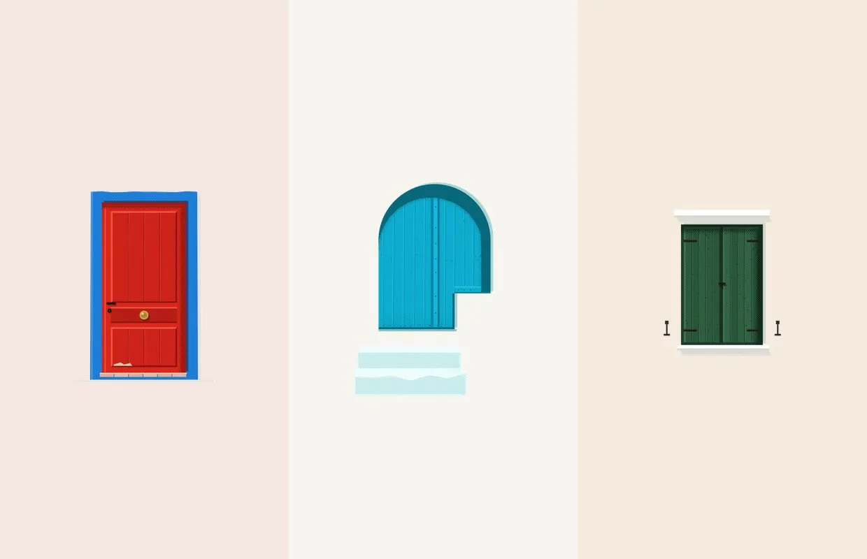
Doors of Jávea, a side project years in the making
I've been illustrating the doors and windows of Jávea, on Spain's Costa Blanca, one at a time. Here's how it started and how it's made.
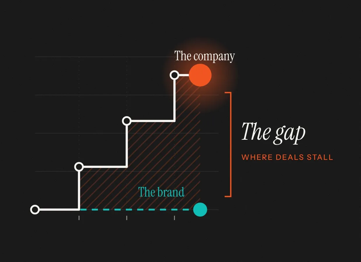
When should a fintech rebrand?
Six moments when a new brand pays for itself, and a few when it really doesn’t.
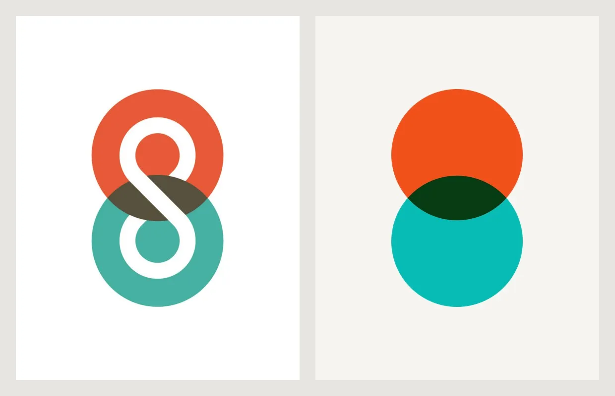
New mark, new site, same studio
Fourteen years after our last rebrand, we’ve simplified the logo to a single 8 and rebuilt the website from scratch.
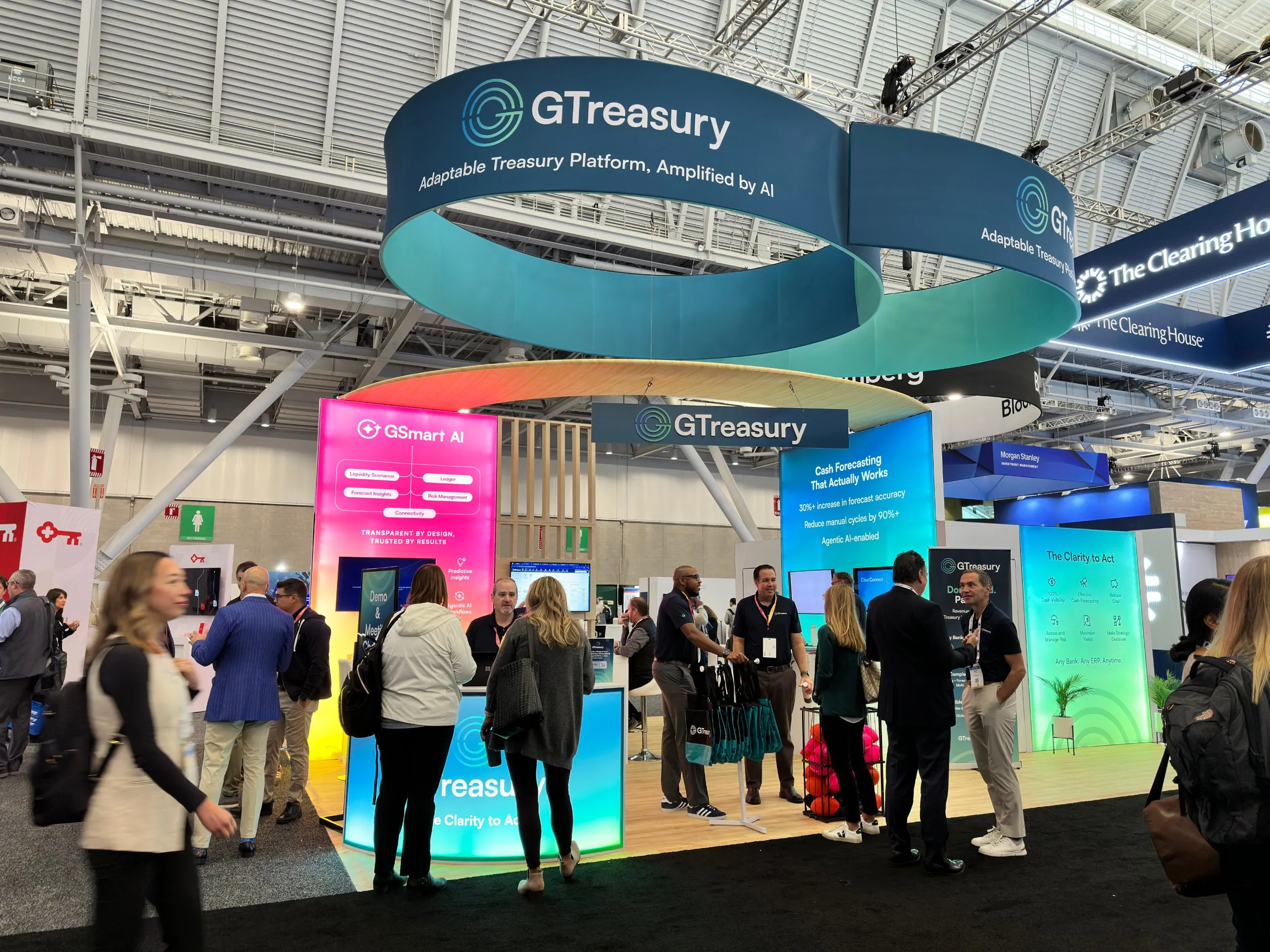
How we rebranded GTreasury before a $1bn acquisition
A treasury platform that had outgrown its look, a booth that stopped people in their tracks, and a client who called us straight back.
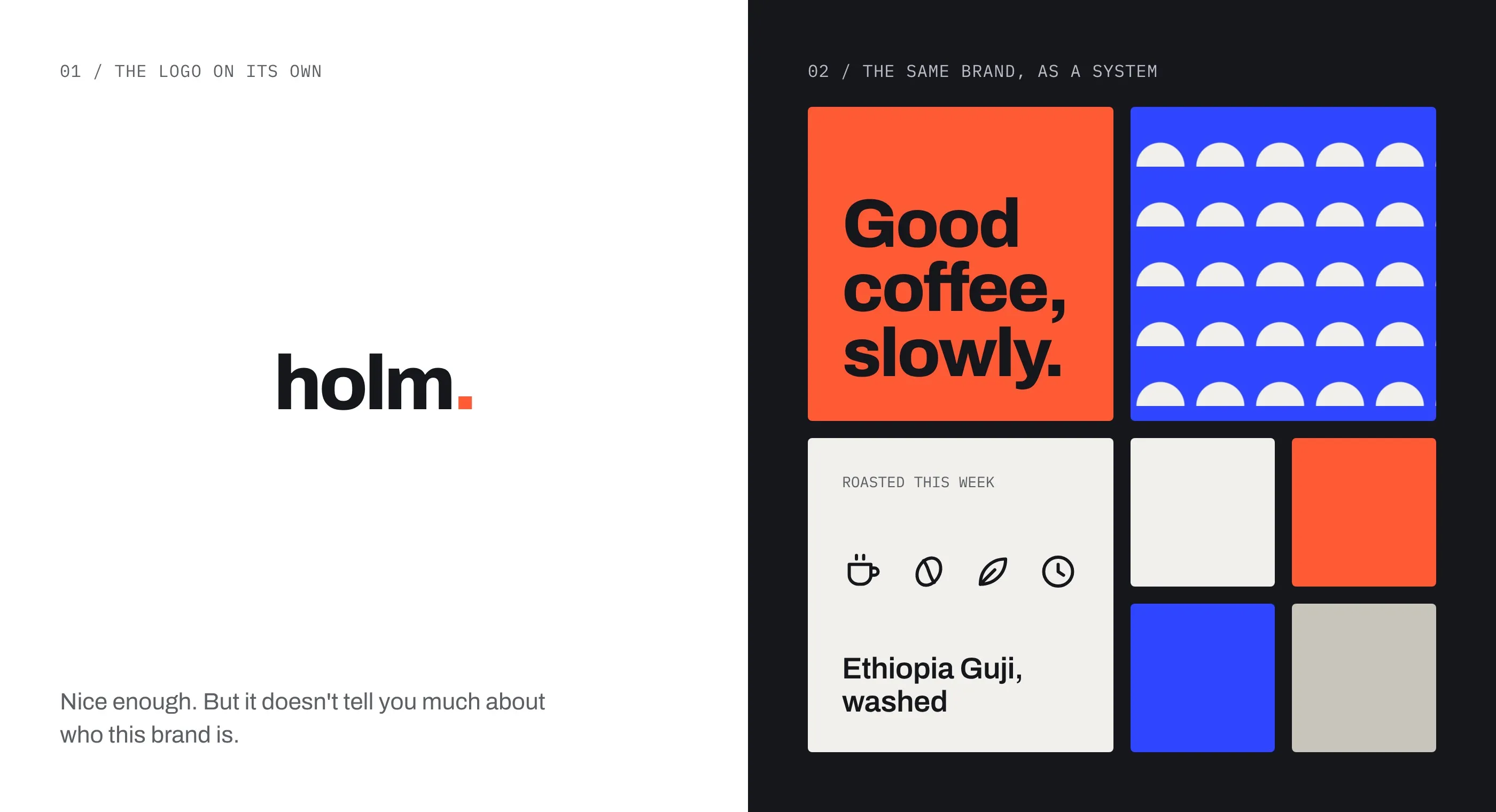
Your logo isn’t doing the heavy lifting
The logo is the bit everyone points at. The system around it is what does the work.
Why custom illustration and icons make brands more memorable
Stock images and free icon sets are everywhere. Custom gives you a look nobody can copy.
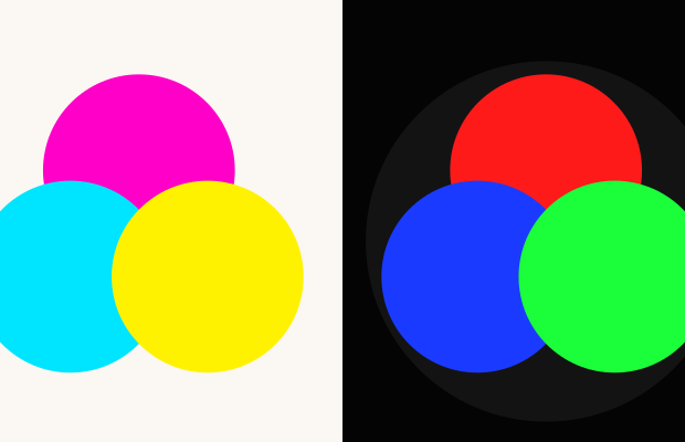
Why your brand colours change in print
Your orange looks perfect on screen, then arrives on the booth looking tired.
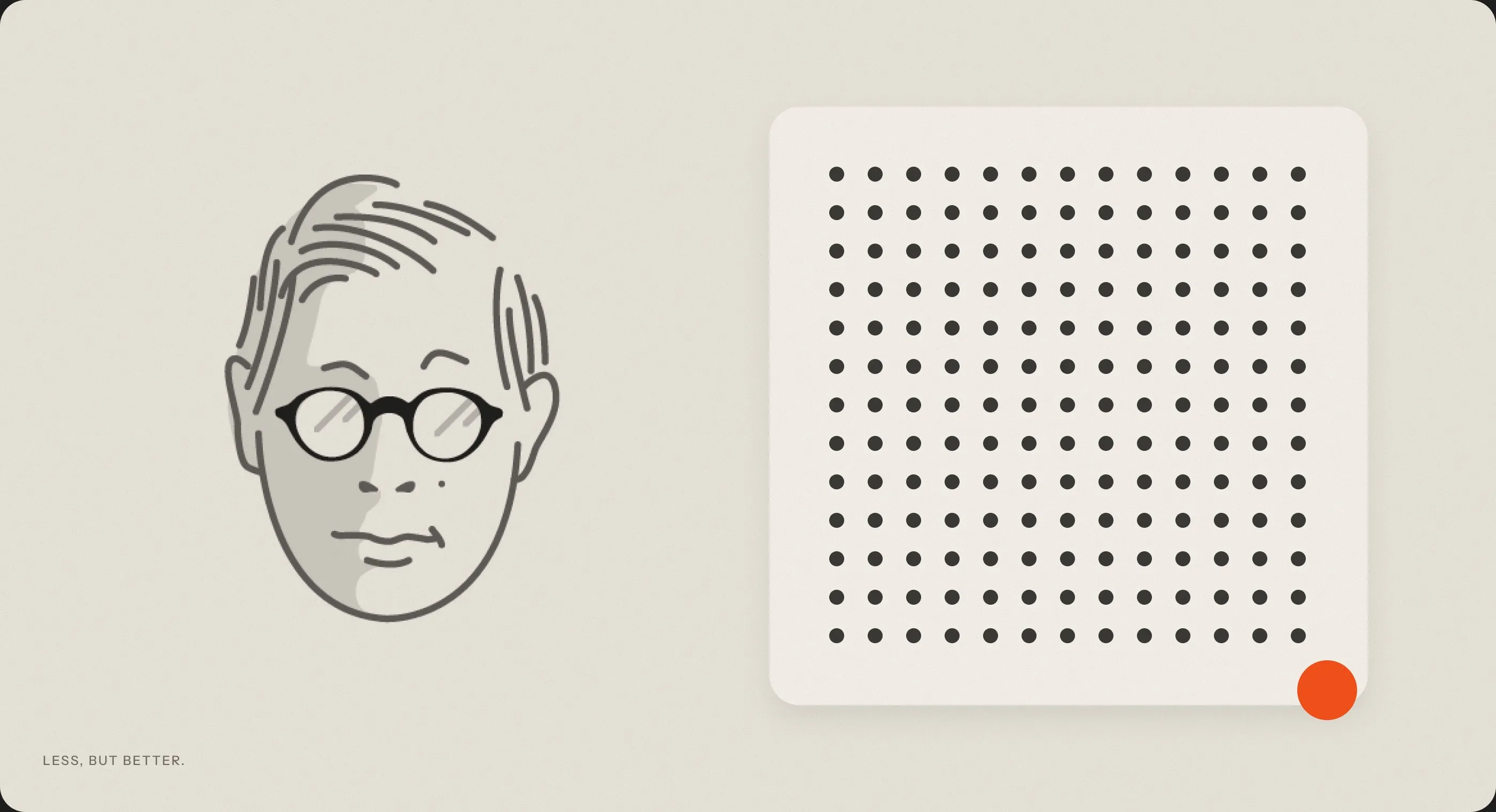
The ten commandments of good design
Dieter Rams’ ten principles, with our illustrations, and what they mean for brands today.
Nothing here yet. Try another topic.
From the shop.
Mugs and tees from the studio, and a few of Matt’s own designs.
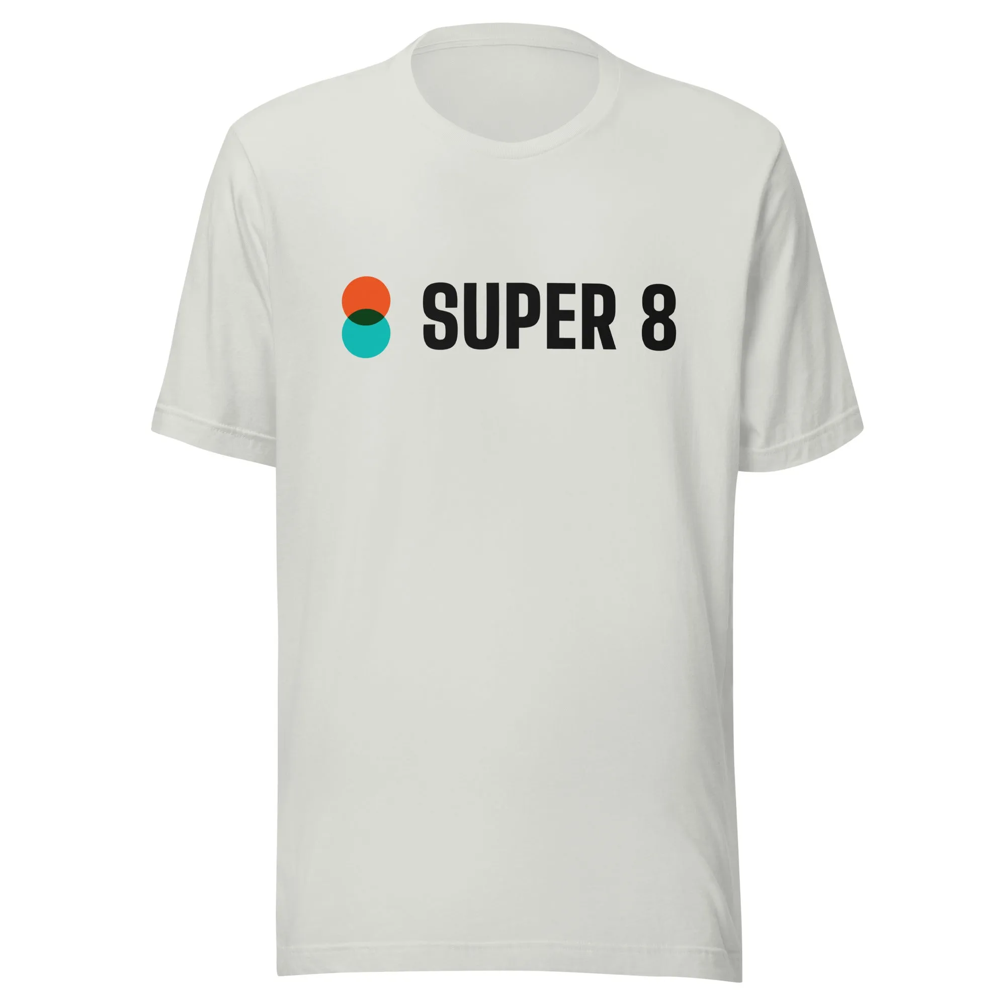
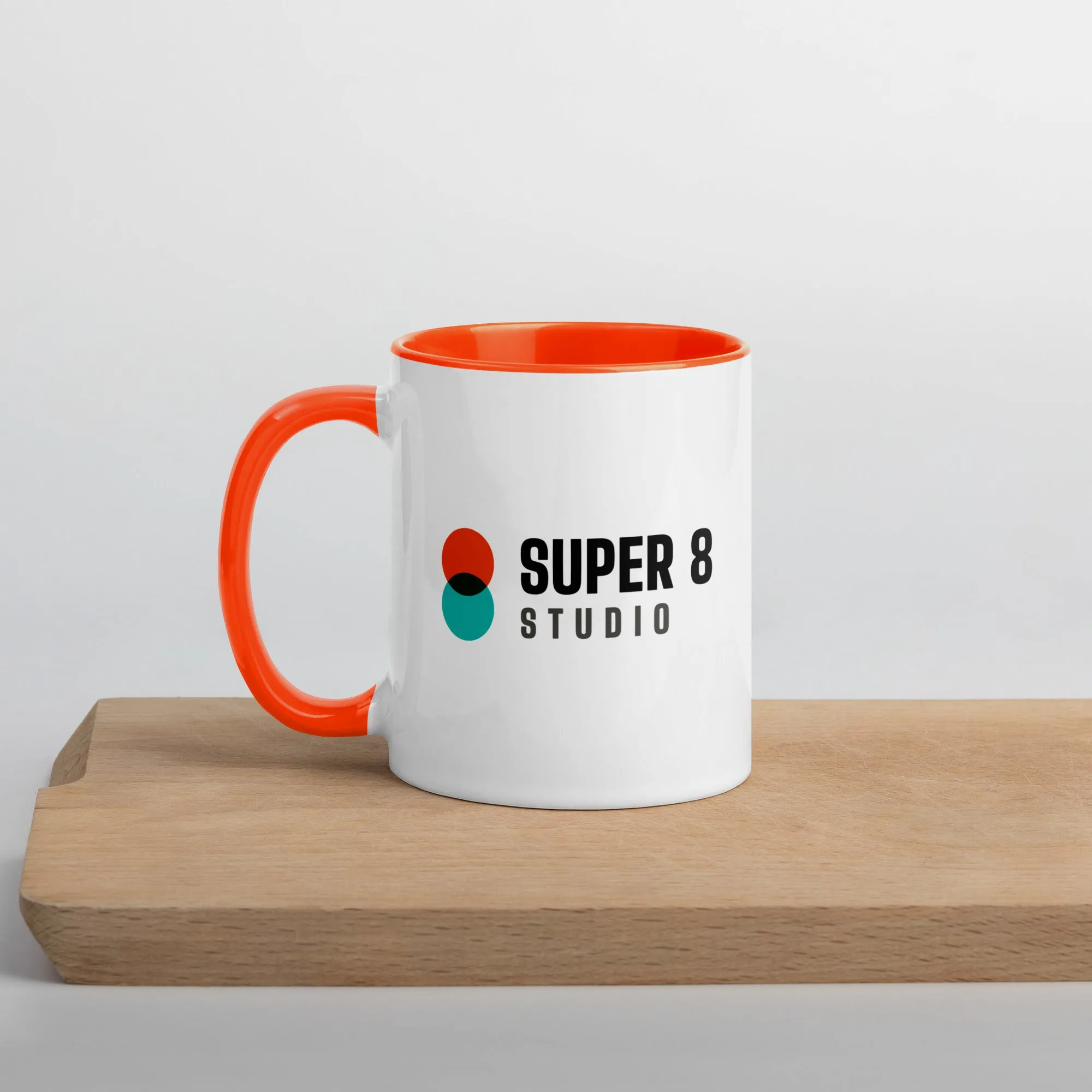
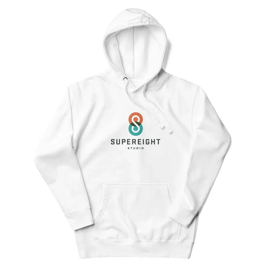
Super Threads
Our own merch shop: Super 8 mugs, tees and hoodies.
Cotton Bureau
Matt’s designs on tees, mugs and more, printed in Pittsburgh.
From the archive.
Talks, interviews and studio notes since 2012
- 2023Introducing the Super Threads shopNews
- 2019Interview with Matt Hamm on the Elastic Brand PodcastInterview
- 2017Beyond Pixels: my vintage Star Wars collection, for net magazineFeature
- 2016Freshly Laundered: designer interview with Matt HammInterview
- 2015Our Parkopedia icon, featured on the App StoreWork
- 2014Trust your gut instinctTalk
- 2014New Bowel Cancer Research website goes liveWork
- 2013Internal design commentaryProcess
- 2013Learning to live with ‘flat design’Opinion
- 2012Stepping out of your comfort zoneTalk
- 2012Illustrating UITalk · Video