Your logo isn’t doing the heavy lifting.
The logo is the bit everyone can point at, but it’s rarely the part doing most of the work. Typography, colour, layout, illustration, icons and patterns are what make a brand recognisable, everywhere it shows up.

Listen to this article
5 min · Read aloud by your browser
5:00
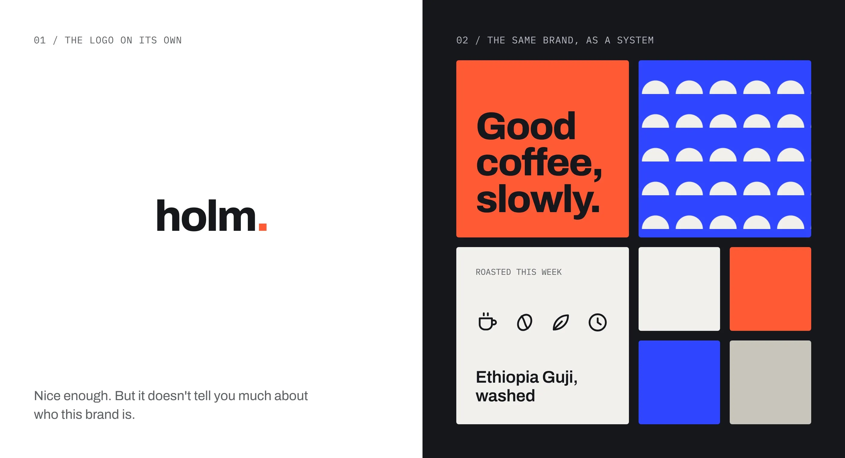
A lot of new brand conversations start in the same place: “We need a new logo.” And we totally get it. The logo is the bit everyone can point at. It goes above the door, in the email signature, on the side of the van. It feels like the brand.
But after a lot of years doing this, we’ve come to a slightly unpopular conclusion. The logo is probably the least important part of a brand identity. Not unimportant, just not the part doing most of the work.
The logo is the signature, not the letter.
Think about how often people actually see your logo, and how big it is when they do. A tiny icon in a browser tab. A small mark in the corner of a social post. Sitting quietly in a footer. Most of the time it’s just signing off.
What people really experience is everything else. The headline they read. The colours that stop them scrolling. The way a page is laid out, the illustration on the packaging, the little icon that tells them where to tap. That’s where recognition gets built, usually well before anyone looks at the logo.
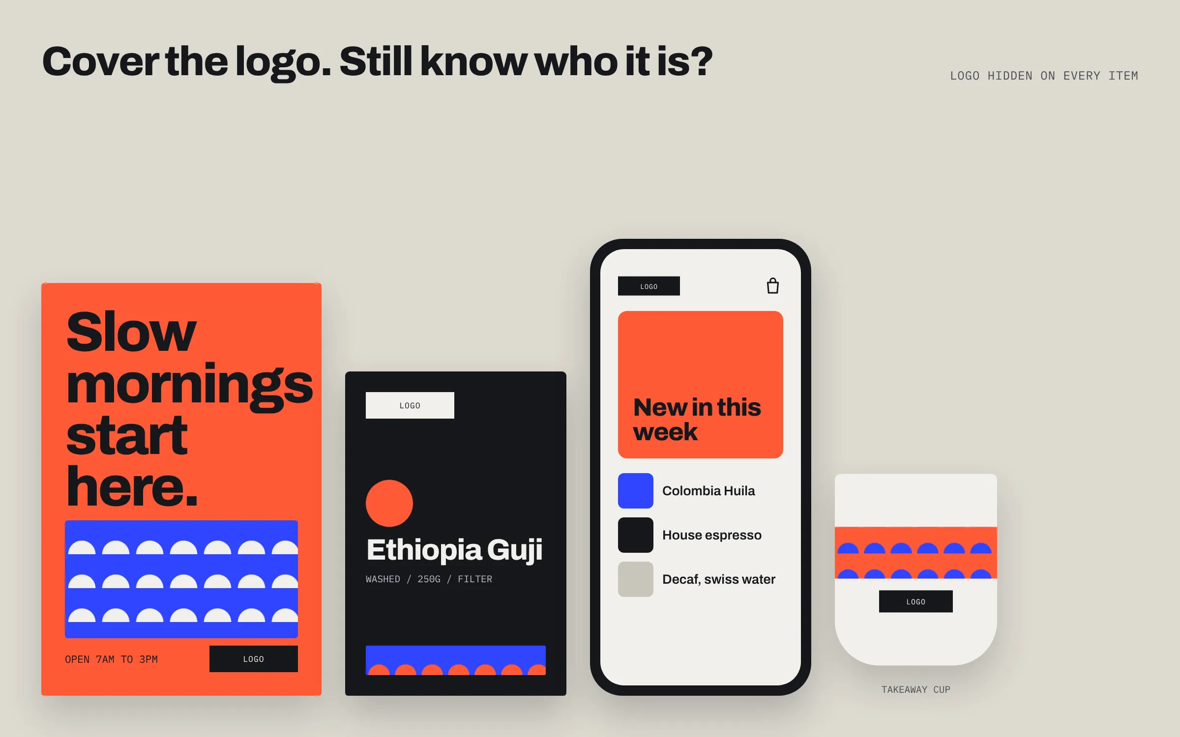
Try it with a few brands you know well. Cover up the logo and you’ll still know exactly who they are. That’s the system doing its job.
What we mean by a system.
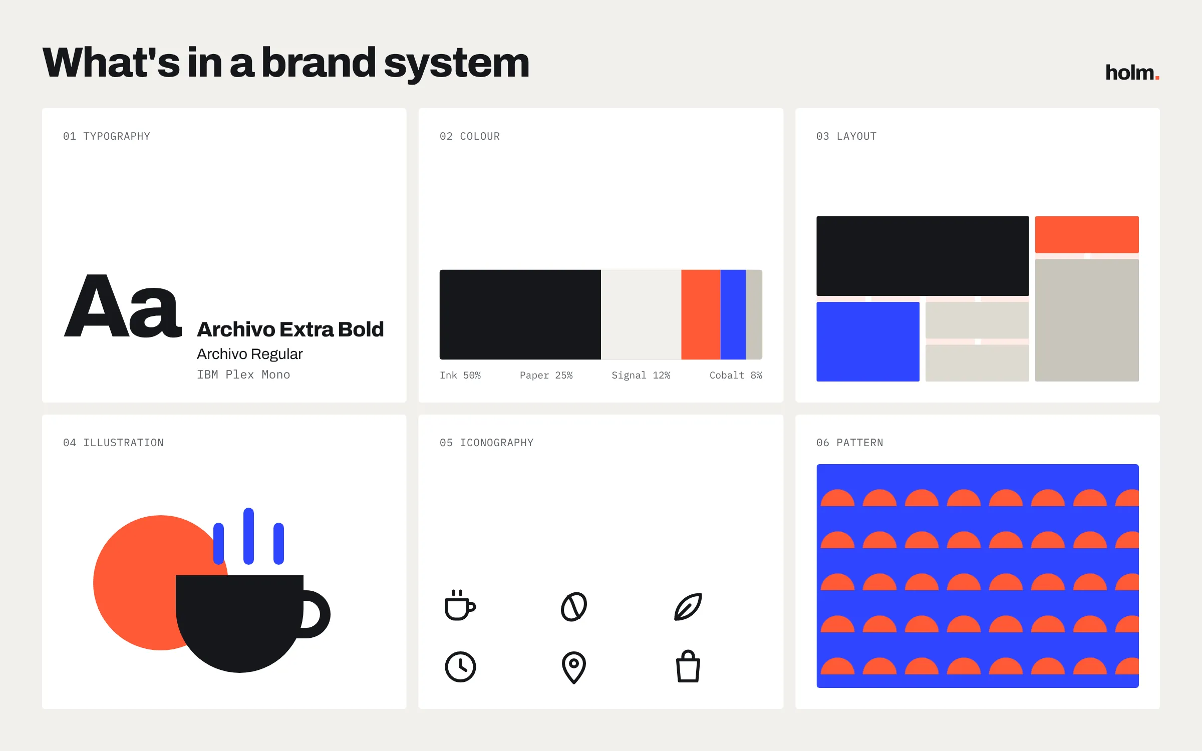
A brand system is the set of tools and rules that let a brand show up consistently wherever it goes. For us, that usually means:
- Typography. Type does more talking than anything else in an identity. The typefaces you pick, and how you set them (weights, sizes, spacing, how big a headline is allowed to get), shape the tone of every word a brand puts out.
- Colour. A palette is more than a main colour and a few extras. It’s knowing which colours lead, which support, how much of each to use and how they behave together. Get the balance right and people can spot you from a thumbnail.
- Layout. Grids, margins, how images and words sit together. A consistent approach gives everything a recognisable rhythm, whether it’s a website, a brochure or a pitch deck.
- Illustration and imagery. A distinctive illustration style or a clear direction for photography gives a brand a personality that’s really hard to copy.
- Iconography. Icons are small, but there are loads of them and they turn up everywhere. A set drawn with the same care and logic as the rest of the identity quietly holds things together.
- Patterns and graphic devices. The shapes, textures and motifs that fill a space, frame a photo or wrap a box. These often end up more recognisable than the logo itself.
Built for real life.
The real test of an identity isn’t how it looks on a presentation board. It’s how it holds up on a Monday morning when someone needs an Instagram story, an exhibition banner, a newsletter and a set of slides by Friday.
Brands live in so many places now: screens of every size, print, packaging, motion, signage, merch. A logo on its own can’t tell you how to handle any of that. A good system can. It gives people the building blocks, and the confidence, to make something that feels right without having to call the designer every time.
“A lonely logo just gets stretched, squashed and stuck on things.”
It’s also what lets a brand grow. New products, new channels, new people on the team. A solid system flexes to cover them. A lonely logo just gets stretched, squashed and stuck on things.
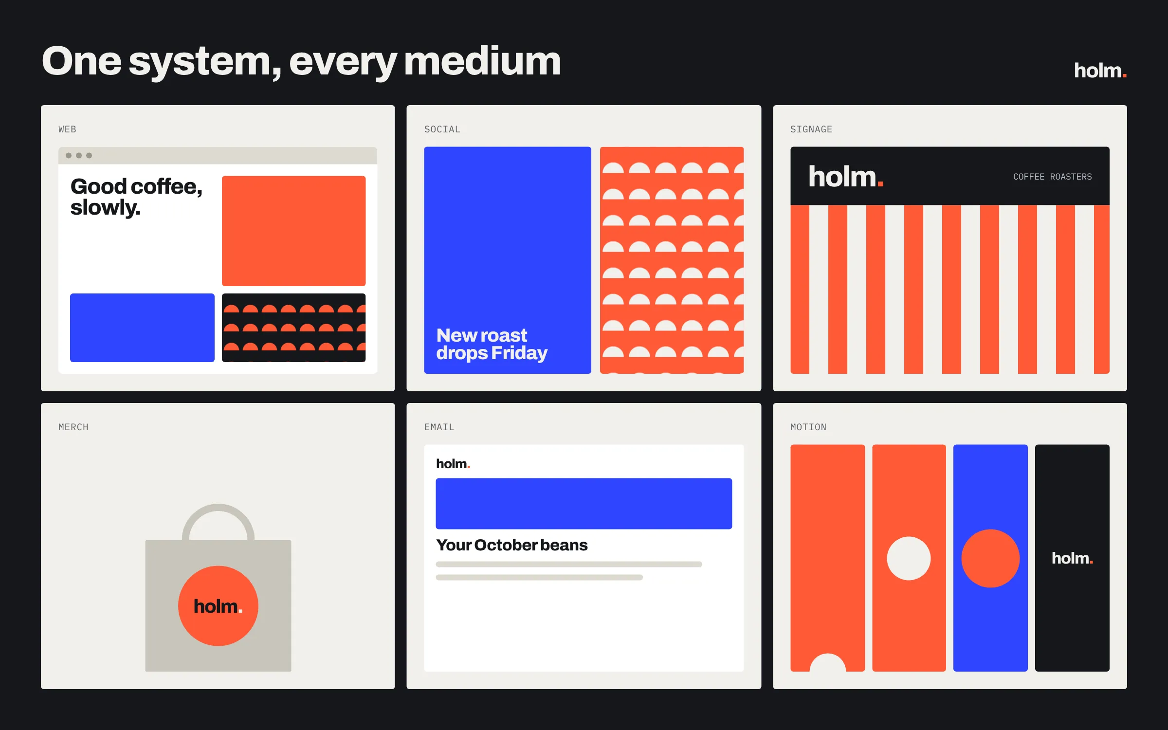
Judge it in the wild.
This is also why you can’t really judge a new identity by looking at the logo on its own. A mark sitting in the middle of a white screen tells you surprisingly little. It’s a bit like judging a band by their font.
You need to see it in context, out in the wild. On a busy high street, in a crowded feed, on a phone screen at a bus stop. You need to see how it comes alive when someone clicks, scrolls and taps, and how it moves when it’s animated. A lot of the personality of a modern brand lives in those moments, and none of it shows up in a static logo.
And most importantly, you need to see how people respond to it. Do they recognise it? Do they get it? Does it make them feel something? That’s the real measure of whether an identity works, and it’s the system, not the logo, that gets you there.
So where does that leave the logo?
Still important. We love a good logo, and we’ll happily spend days obsessing over one. We just see it as one piece of the kit rather than the whole thing. Its job is to be the full stop. The system writes the sentence.
So when we start a brand project, we spend less time asking “what should the logo look like?” and more time asking “how should this brand look, sound and behave everywhere it turns up?” Answer that properly and the logo usually falls into place.