Why custom illustration and icons make brands more memorable.
Stock imagery and free icon sets are everywhere, and your competitors are probably using the same ones. Custom illustration and iconography give your brand a look nobody else can copy.

Listen to this article
5 min · Read aloud by your browser
5:00
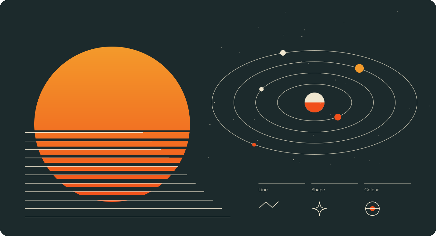
Open a dozen B2B websites and you’ll see the same smiling teams around the same laptops. Stock photography is quick and cheap, but it rarely says anything about you, and your competitors are probably using the same images.
Illustration gives you a visual voice.
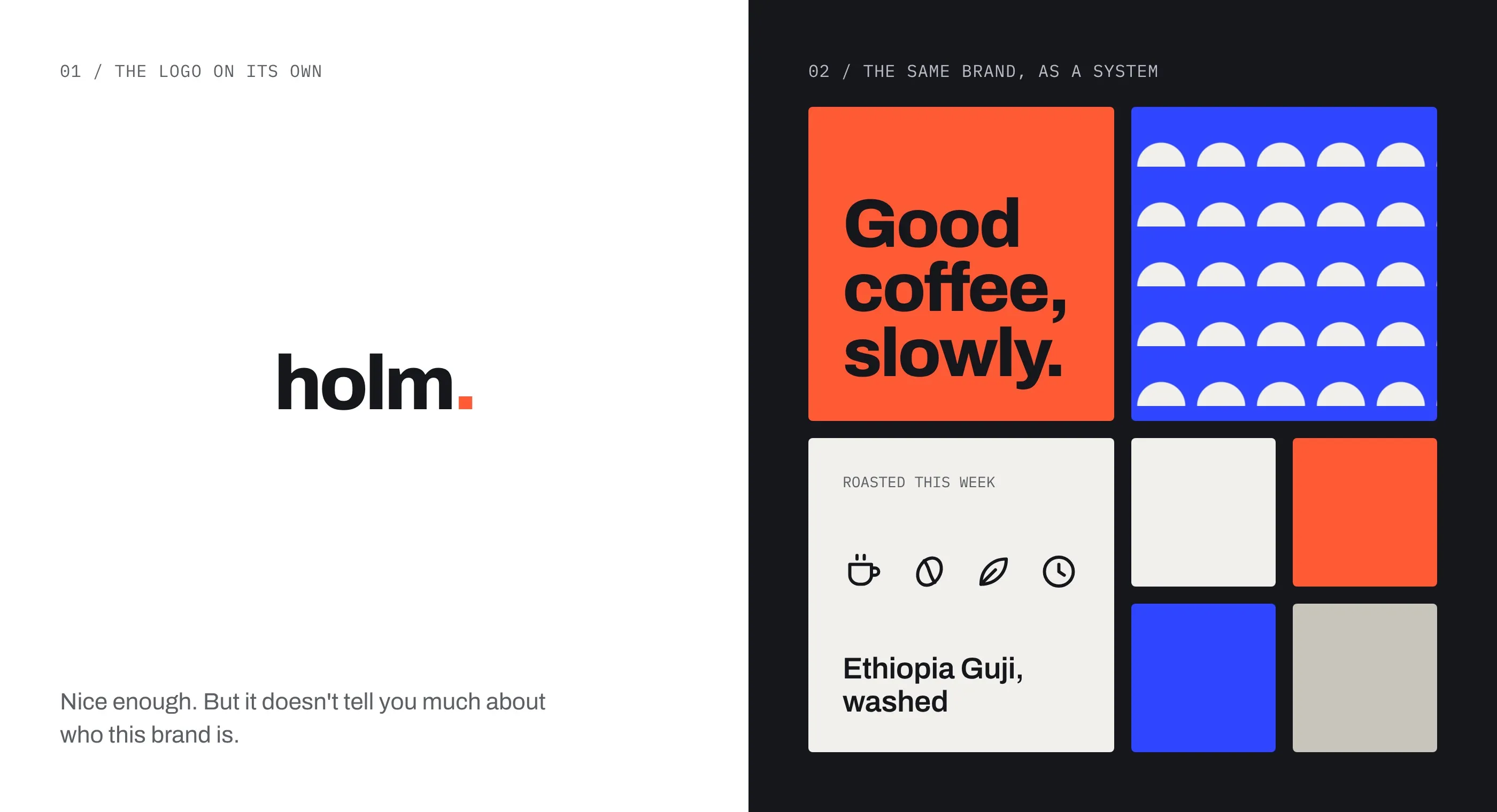
A custom style becomes part of your identity, as recognisable as your logo or colours. People start to know it’s you before they see your name.
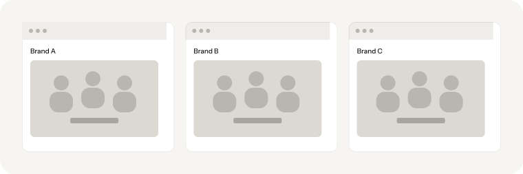
It explains things photos can’t.
Many of our clients sell complex products: data platforms, compliance software, financial tools. Illustration can show an idea, a process or a benefit in a way a photo of an office never will.
“People start to know it’s you before they see your name.”
Custom icons work harder than you’d think.
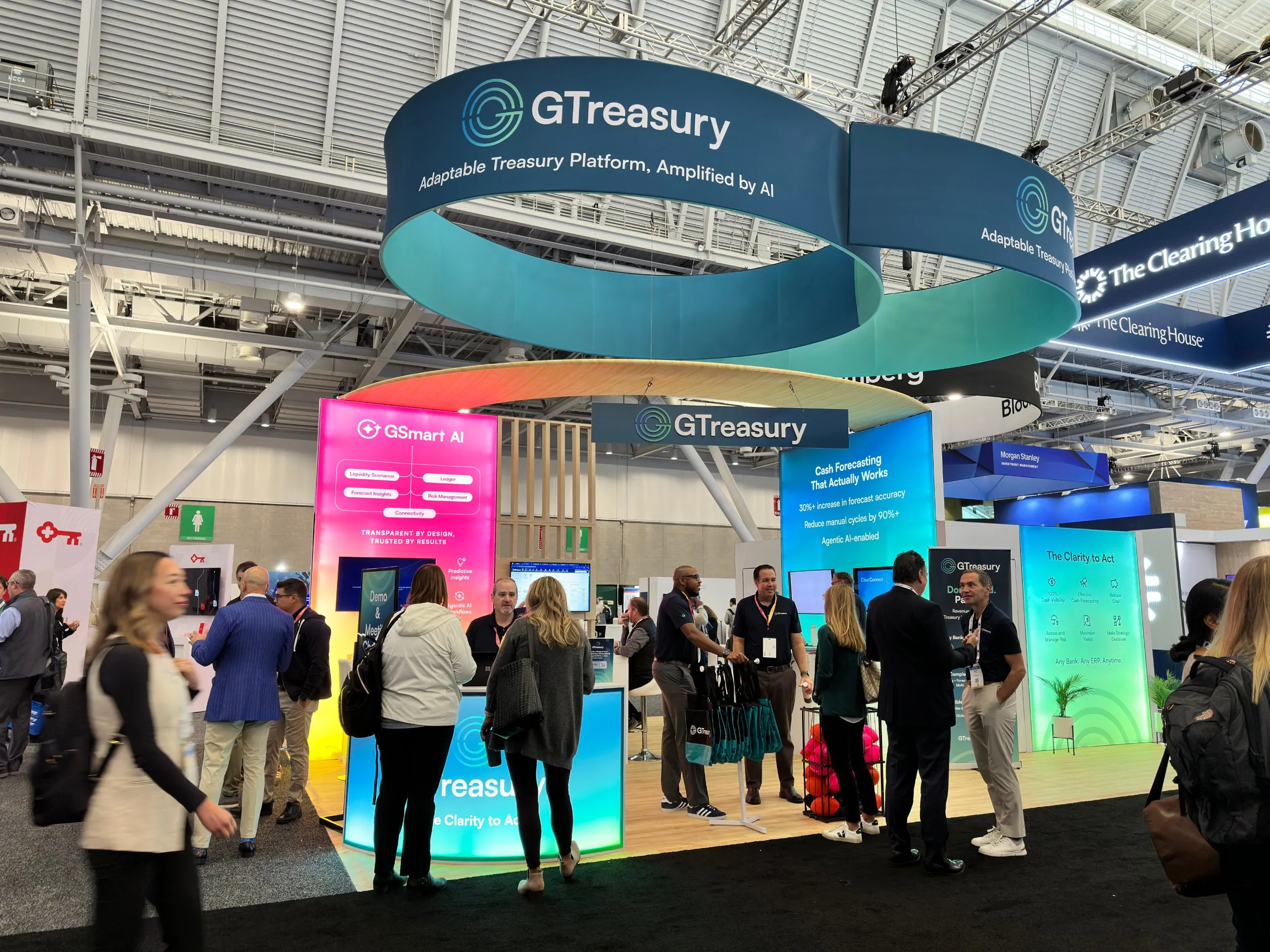
Icons are some of the most-seen pieces of any brand. They sit in navigation, product UI, feature grids, slide decks, signage and booth graphics, often dozens of times on a single page. Most companies grab a free set that thousands of other businesses also use, so the same little shield, rocket and lightbulb turn up everywhere. A custom icon set drawn in your own style, with your line weight, corners and colours, makes even the smallest details unmistakably yours.
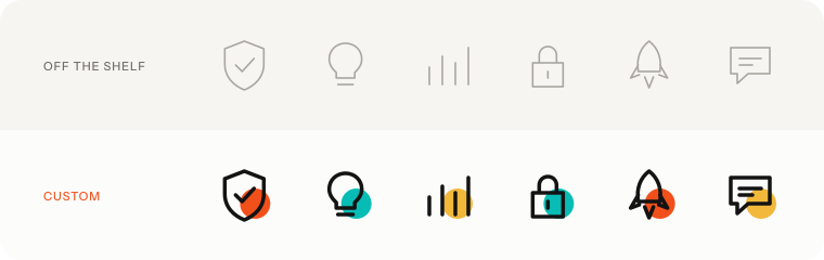
It’s also one of the most cost-effective ways to stand out. A core set of 30 to 50 icons covers most needs, and because every icon follows the same rules, the set is easy to extend as the product grows.
It scales across everything.
A well-defined illustration system works on a website hero, an exhibition stand, an icon set and a 40-page report. Once the style and rules are set, new pieces are faster to produce and always feel on brand. A properly documented system also gives your team guardrails if they use AI tools for ongoing marketing content, so new visuals still look like yours.
It doesn’t have to be expensive.
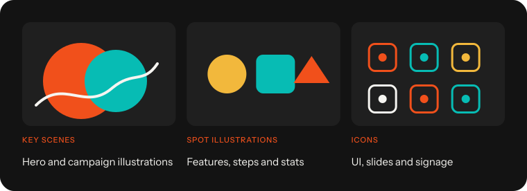
You don’t need hundreds of bespoke drawings on day one. We usually start with a small library of key scenes and icons, plus guidelines, and grow it over time.
If your brand feels like everyone else’s, custom illustration and iconography are two of the quickest ways to change that.