Brand guidelines · Version 1.0 · 2026
The Super 8
identity
how we look, and why.
A short, practical guide to the Super 8 mark, the colours and type that sit around it, and the few rules that keep it looking right wherever it turns up.
01 / Mission
Why we’re
here.
Mission
To help fintech and B2B tech companies look like where they’re heading.
We turn a company’s ambitions and its place in the market into a brand identity and design system that its team keeps using, long after launch. One team, from the first idea to the final line of code.
Vision
Brands designed to be trusted.
We love crafting brands and websites with intent and optimism, working alongside talented specialists to make work that’s built to last and easy to trust.
What we believe
- 01Clarity
If people can’t understand what a company does, they won’t trust it. We cut things back until the point is obvious.
- 02Craft
Details are what make something feel credible. We sweat the spacing, the code and the copy, because people notice when nobody did.
- 03Design + code
The idea and the build live under one roof, so what we design is what ships.
- 04Senior, start to finish
Every project is led and designed by experienced people. No juniors learning on your brand.
- 05In it for the long run
We work like part of your team, and we’d rather build something that lasts than something that trends.
02 / The logo
Two circles.
One eight.
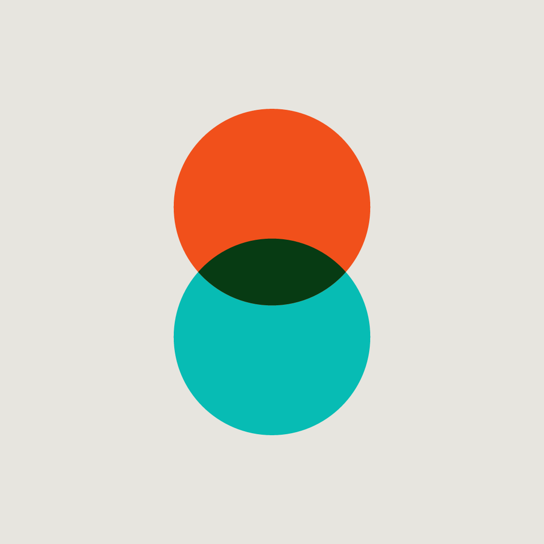
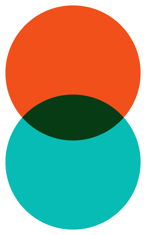
The mark is a Venn diagram turned on its side. It’s about the two things the studio has always been built on: design and code. Orange is design, teal is code, and the deep green lens where they overlap is where we do our best work. Stacked up, the two circles also make an 8.
The idea
Design + code
two halves, one studio.
A lot of studios treat design and development as separate jobs, handed over the fence. We don’t. A brand only works when the idea and the build pull in the same direction, so we keep both under one roof. The mark is that dualism drawn as simply as possible: two equal circles, neither more important than the other, and a third thing that only exists when they meet.
03 / Construction
Built on
one circle.
Everything comes from one unit: the circle radius, r. Two circles of radius r overlap by 0.68r. The whole mark is 2r wide and 3.32r tall, a 100 × 166 grid.
- Circle
- Radius r, both identical
- Overlap
- 0.68r (34 on the 100 grid)
- Mark ratio
- 100 wide × 166 tall
- Lockup gap
- 0.4 × mark height
- Wordmark size
- Font size equals mark height
- Tracking
- +0.02em, all caps
04 / Clear space and minimum size
Give it room.
Keep a margin of at least r (half the mark’s width) clear on every side of the logo. No text, images or edges inside it.
Below these sizes the green lens starts to disappear. For favicons, use the square favicon file, which centres the mark on a 166 × 166 canvas.
05 / Colour versions and backgrounds
Full colour first.
Full colour on light backgrounds. On Ink and Navy the lens turns Stone. On the coloured page themes, like Studio Green and Rust, the mark goes white. The full colour mark never sits on orange or teal.
06 / Don’ts
Please don’t.
Most problems come from someone trying to make the logo fit. If it doesn’t fit, change the layout, not the logo.
07 / Colour
Warm paper,
bright signal.
Paper and Ink do most of the work. Orange and Teal come from the mark and are used sparingly, as signals, not as backgrounds for text. The supporting colours set the mood of each page.
Core
Design. The top circle, accents and one highlight per view.
- HEX
- #F1501B
- RGB
- 241 80 27
- CMYK coated
- 0 80 100 0
- CMYK uncoated
- 0 70 90 0
- Pantone
- 172 C
Code. The bottom circle, status dots and serif accents on dark.
- HEX
- #07BCB4
- RGB
- 7 188 180
- CMYK coated
- 75 0 35 0
- CMYK uncoated
- 65 0 30 0
- Pantone
- 3262 C
Where they meet. Reserved for the mark.
- HEX
- #073B13
- RGB
- 7 59 19
- CMYK coated
- 85 30 100 60
- CMYK uncoated
- 80 25 95 55
- Pantone
- 3435 C
Type, the wordmark and dark panels.
- HEX
- #131313
- RGB
- 19 19 19
- CMYK coated
- 60 40 40 100
- CMYK uncoated
- 50 40 40 100
- Pantone
- Black 6 C
The default background.
- HEX
- #E7E5DF
- RGB
- 231 229 223
- CMYK coated
- 0 1 5 10
- CMYK uncoated
- 0 1 5 8
- Pantone
- Warm Gray 1 C
Cards on Paper, and type on dark.
- HEX
- #F6F5F1
- RGB
- 246 245 241
- CMYK coated
- 0 0 2 3
- CMYK uncoated
- 0 0 0 0
- Pantone
- White stock, no ink
Supporting
- HEX
- #21306B
- CMYK
- 100 85 20 15
- Pantone
- 2757 C
- HEX
- #0D3B38
- CMYK
- 90 40 65 55
- Pantone
- 3308 C
- HEX
- #9FECE4
- CMYK
- 35 0 15 0
- Pantone
- 331 C
- HEX
- #B8401C
- CMYK
- 15 85 100 5
- Pantone
- 1675 C
- HEX
- #C9C6FF
- CMYK
- 20 20 0 0
- Pantone
- 270 C
- HEX
- #6F6C66
- CMYK
- 45 40 45 25
- Pantone
- Warm Gray 10 C
Print values are nearest matches, chosen by eye rather than by automatic conversion. Coated CMYK is for FOGRA39 in Europe. Always check against a current Pantone guide and a printed proof before a big run.
Accessible pairings
WCAG contrast. AA needs 4.5:1 for body text and 3:1 for large type (24px and up).
| Pairing | Ratio | Use for |
|---|---|---|
| Ink on Paper | 14.8:1 | Everything |
| Stone on Ink | 17.0:1 | Everything |
| Stone on Navy | 11.3:1 | Everything |
| Teal on Ink | 7.8:1 | Accents and body text on dark |
| Orange on Ink | 5.2:1 | Accents on dark |
| Orange on Paper | 2.8:1 | Large display type only, never body text |
| Teal on Paper | 1.9:1 | Decoration only, never text |
08 / Typography
Loud, then
soft.
Three families, all free and open source. A tall, condensed display face for headlines, a sharp italic serif for the turn of phrase, and a clean sans for everything you actually read.
Brands
designed
Black (900), all caps, tracking +0.01em to +0.02em, leading 0.9. Headlines and the wordmark.
to be trusted.
Regular italic, sentence case. A short phrase that follows a headline. One per view.
Brand and web design for fintech and B2B tech, since 2009.
We make complicated companies easy to trust. That means clear positioning, a confident identity and a website that does the selling for you.
Regular 400 for body, Medium 500 for intros and navigation, SemiBold 600 for labels and buttons.
Web type scale
| Style | Font | Size (desktop) | Leading |
|---|---|---|---|
| Display | Big Shoulders 900 | 128–222px | 0.86 |
| H1 | Big Shoulders 900 | 88px | 0.92 |
| Accent | Instrument Serif Italic | 1–1.1× the headline | 1.0 |
| Intro | Instrument Sans 500 | 22–30px | 1.35 |
| Body | Instrument Sans 400 | 17px | 1.55 |
| Label | Instrument Sans 600, caps | 13px, +0.08em | 1.2 |
09 / Tone of voice
Say it
plainly.
We sound like the work looks: clear, confident and human. We write for busy people at serious companies, so we get to the point and skip the hype.
Say what we mean in plain words. If a sentence needs reading twice, rewrite it.
We know our stuff, so we don’t need superlatives. Show the work and let it do the talking.
Write like a person talking to a person. Use “we” and “you”, contractions and the odd bit of warmth.
We don’t overpromise or hide behind marketing speak. Specifics beat adjectives every time.
In practice
We leverage cutting-edge creative solutions to deliver best-in-class brand experiences.
We design brands and websites for fintech and B2B tech.
Our passionate team of world-class creatives is dedicated to exceeding expectations.
Every project is led by experienced designers, start to finish.
Reach out today to unlock your brand’s full potential!
Got a project? Tell us about it and we’ll reply within a day.
Writing rules
- British English: colour, organise, centre.
- Short sentences. One idea each.
- “We” for the studio, never individual names in client work.
- Numerals for numbers: 3 weeks, 150+ projects.
- Sentence case for body headings. Caps only in Big Shoulders.
- No em dashes. Use a full stop, a comma or a colon.
Words we avoid
If you catch yourself reaching for one of these, say the specific thing instead.
- leverage
- synergy
- solutions
- world-class
- cutting-edge
- best-in-class
- passionate
- unlock
- seamless
- innovative
10 / Motion
The flip.
On screen the mark acts out the idea. Design and code slide through each other and trade places, then the whole mark turns half a turn, ending exactly where it started. Every other cycle it gets a short RGB glitch instead, like an old colour TV.
- Duration
- 2.2s per flip
- Easing
- cubic-bezier(0.65, 0, 0.35, 1)
- Frequency
- On load, then every 20s
- Accessibility
- Off when reduced motion is set
11 / Downloads
Logo files.
Every lockup in every colourway. SVG for web and print (text is outlined, so no fonts needed), transparent PNG for everything else. Lockup PNGs are 2000px wide.







Social and media
Avatars keep the mark inside a circle crop. Share cards fit link previews on LinkedIn, Bluesky and Slack.





Need something that isn’t here, or have a question about using the brand?
hello@supereightstudio.com