How we rebranded GTreasury before a $1bn acquisition.
In 2024 we rebranded GTreasury and redesigned its website, then took the new brand to the busiest conference in corporate treasury. Not long after, Ripple bought the company for $1 billion, and asked us to do it all again.

Listen to this article
5 min · Read aloud by your browser
5:00
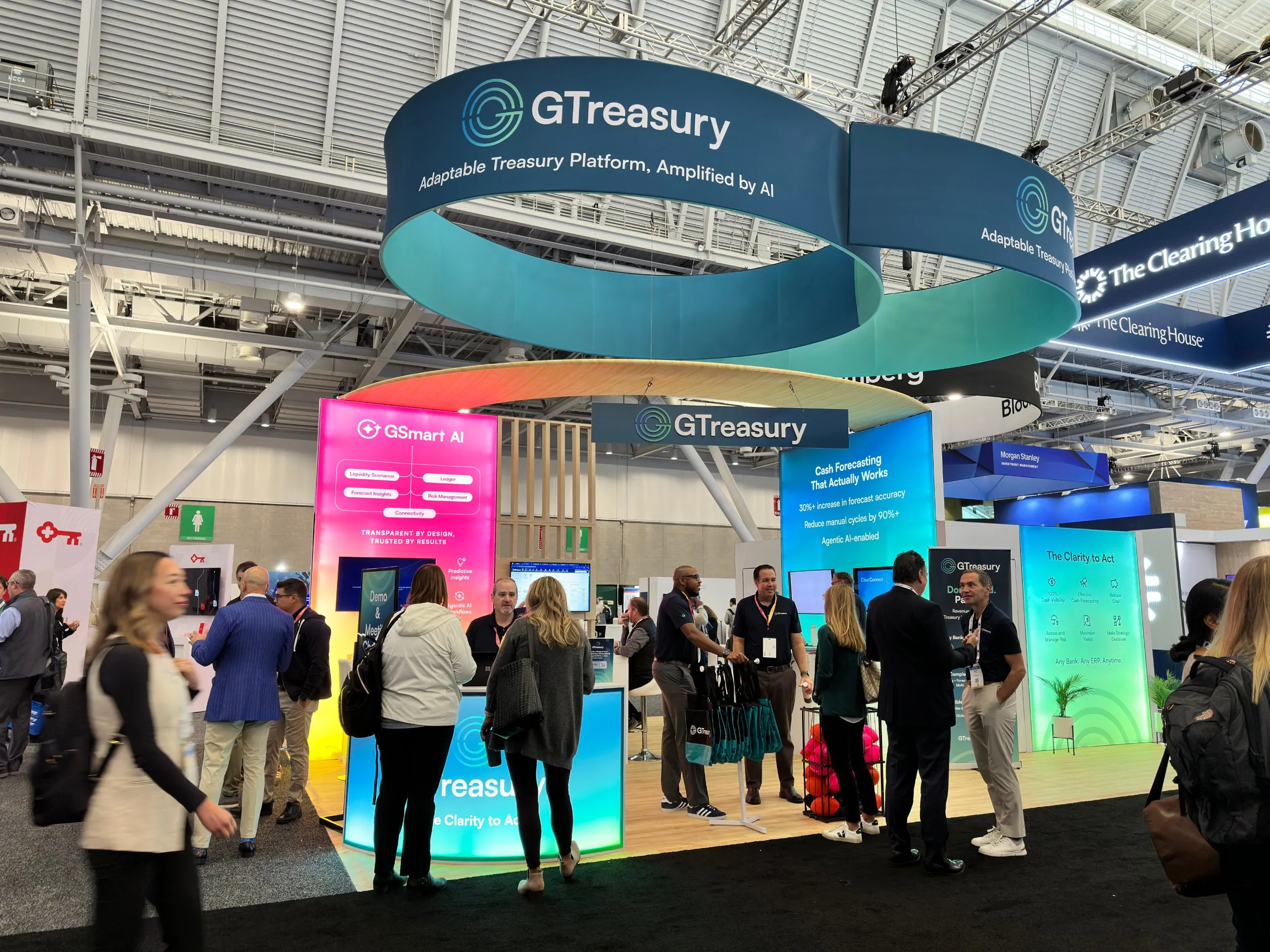
In 2024 we rebranded GTreasury and redesigned its website. Then we took the new brand somewhere much louder: a big, backlit booth at the AFP conference. Not long after that, Ripple bought GTreasury in a $1 billion deal. We’d love to say we planned it that way. We didn’t. But the story says something about why brand matters for B2B companies, so here’s how it came together.
A platform that had outgrown the way it looked.
GTreasury makes treasury management software for large companies: cash visibility, forecasting, payments, risk, and the connections between a business’s data and its banks. It’s serious, complicated technology, sold to finance teams who don’t take chances.
The product had grown up. The brand hadn’t. The identity and website no longer matched how sophisticated the platform was, or the size of the companies it was selling to. That gap matters more than people think. When an enterprise buyer is about to trust you with their cash, a dated website quietly asks “are these people as big as they say?”
Evolve, don’t throw away.
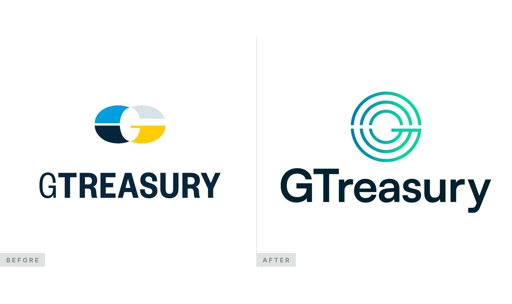
We didn’t start from a blank page. GTreasury had recognition and goodwill in a market where trust takes years to build, so the job was to evolve the identity, not replace it.
The mark became a set of concentric rings forming a G, with a clean crossbar. It reads as a dial or a radar, which suits a product that’s all about seeing everything clearly. A teal-to-green gradient gave it energy without feeling flashy, and it works on white and on the deep navy we used across the system.
For type we paired Satoshi for headlines with Inter for body text. Both are crisp and modern, and Inter in particular holds up at the small sizes you get in product UI, data tables and dense marketing pages.
Built for enterprise scale.
A logo on its own doesn’t do much. What made the rebrand work was everything around it, a design language the whole marketing team could use:
- The website. Clearer UX and stronger enterprise positioning, built around giving finance teams “the clarity to make strategic decisions”.
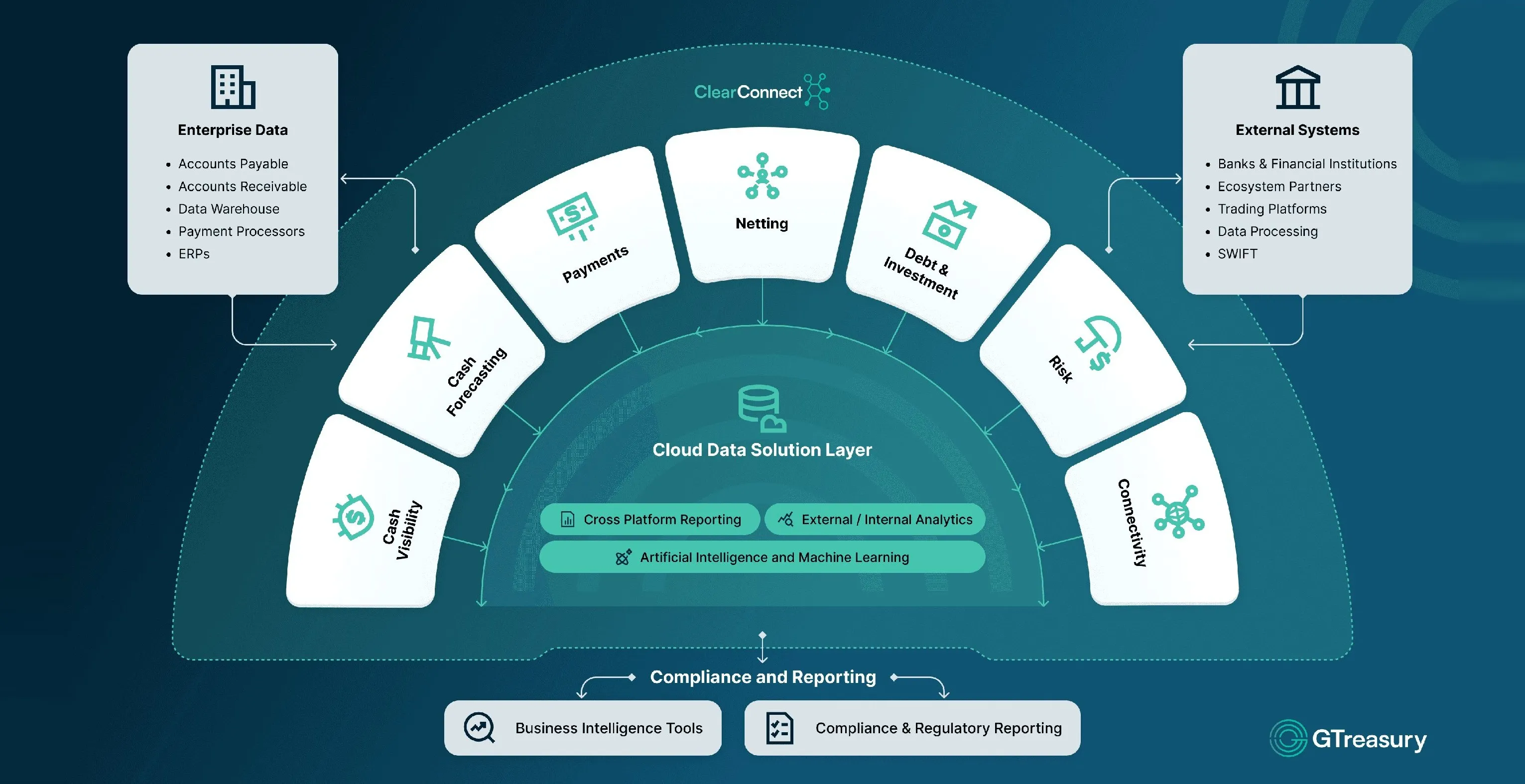
- Platform diagrams. Visuals that show how the pieces fit together, like ClearConnect linking enterprise data to banks and external systems, so a complex product makes sense at a glance.
- Icons, campaigns and presentations. A custom icon set, campaign creative and slide templates, so sales decks and ads felt like the same company as the website.
Taking it to the show floor.
A relaunch on a website is one thing. The real test came after, at AFP, the biggest annual conference for corporate treasury and finance teams.
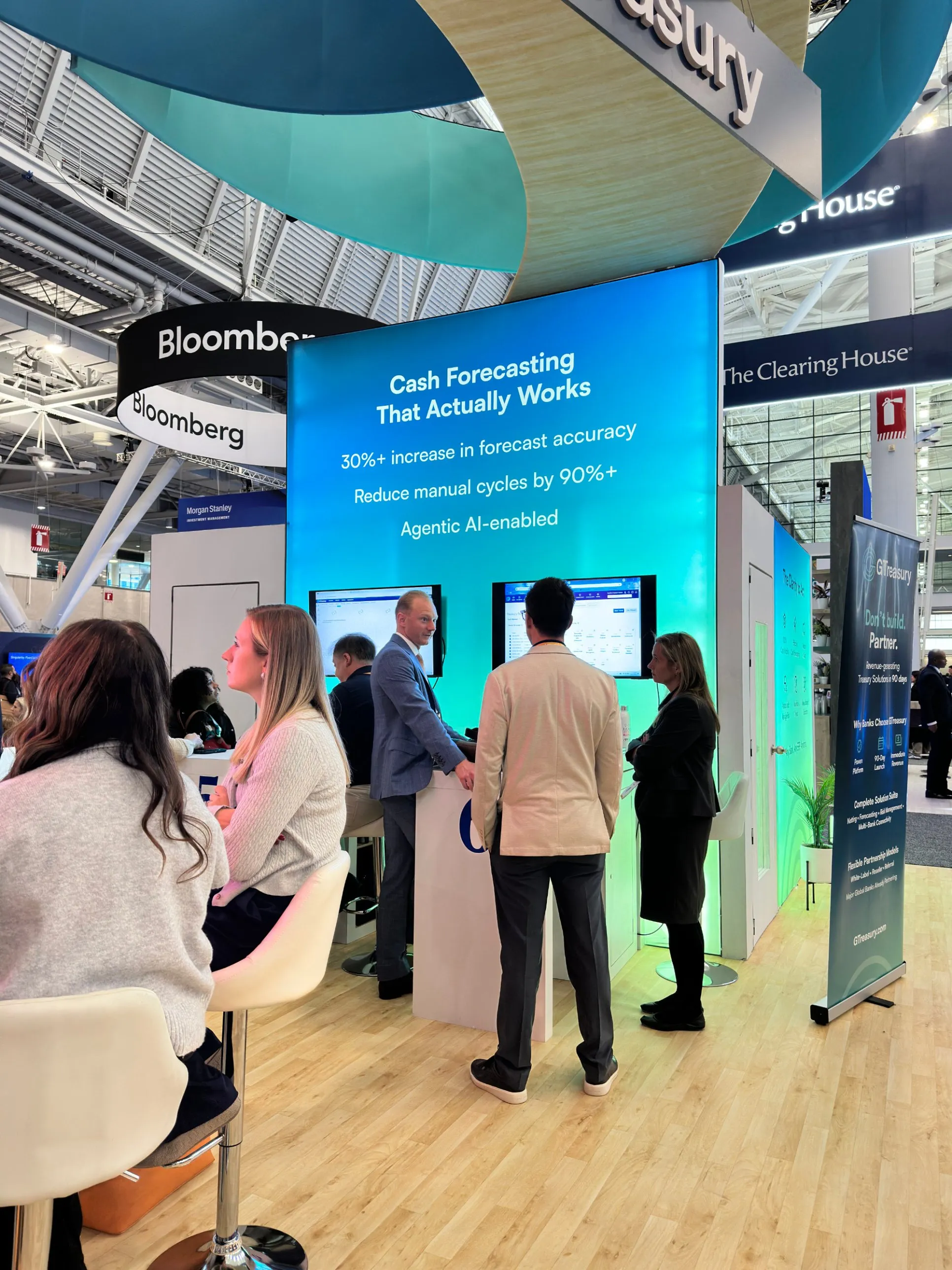
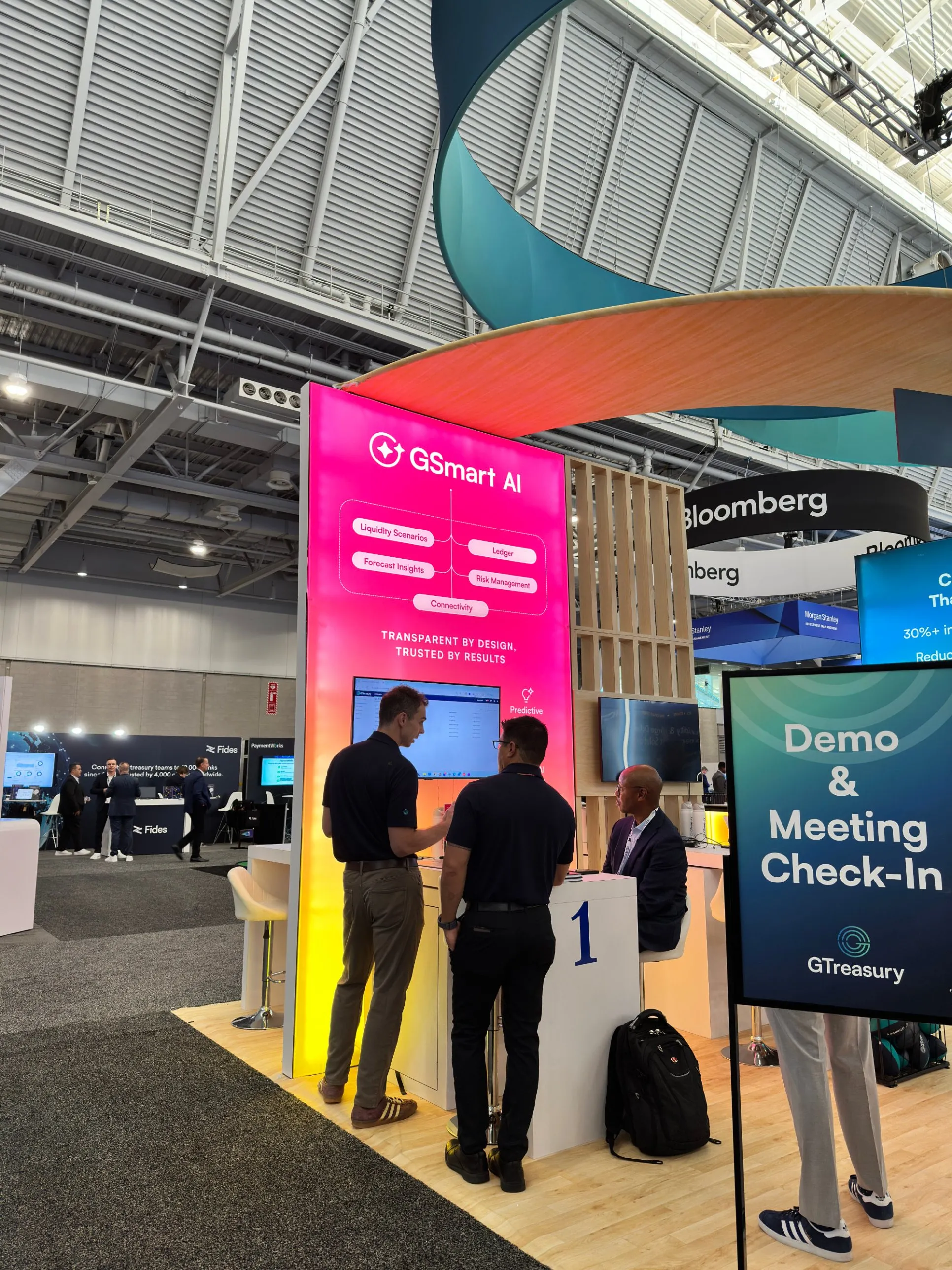
We designed GTreasury a booth to match the new brand, and we went big. Backlit panels, lighting built into the structure, and bold, bright colours for GSmart, the AI side of the platform they were launching. Next to rows of very similar, very corporate stands, it looked completely different.
It worked. It was one of the busiest booths at the show, and people kept coming over just to say how strong it looked. For a finance software company, that’s not the usual reaction.
Then came the acquisition.
Not long after that conference, Ripple acquired GTreasury for $1 billion.
We’d never claim a rebrand or a booth caused an acquisition. The product, the team and the customers did that. We’ve got a feeling some of the conversations behind the deal happened around that show, but we’ll never know for sure. What we do know is that when a company is being looked at closely, by buyers, partners or anyone else, how it shows up is part of the story. GTreasury walked into that moment looking like the modern enterprise platform it already was.
Into Ripple Treasury.
Throughout the GTreasury work, the team kept coming back to one thing: how quickly we turned things around. More than once they told us they didn’t know how they’d have done it without us.
So when the acquisition went through and GTreasury needed to become Ripple Treasury, fast, they called us straight away. For us, that’s the best review there is. They’d seen what we could do under pressure, and trusted us to do it all again.
And it was under pressure. We carried the brand through the transition: reskinning the website, refreshing the marketing assets and aligning the visual language with Ripple’s wider enterprise design. Because the GTreasury system had been built to scale, it could flex into a new parent brand without starting again.
“Super 8 Studio delivered an exceptional brand overhaul and website redesign under extreme time pressure, with outstanding responsiveness and consistently high-quality work throughout.”
You can see both sides of the story in the GTreasury and Ripple Treasury case studies.
What we took from it.
- Fix the gap before it’s noticed. If your product has outgrown your brand, buyers can feel it, even if they can’t say why.
- Evolve when you’ve earned trust. In markets like finance, keeping recognition is worth as much as looking new.
- Design the system, not just the logo. Diagrams, icons, templates and booths are where a brand actually earns its keep.
- Be brave in the room. Events are where buyers meet you in person. A booth that stands out gets the conversations.
- Build it to bend. You never know when you’ll need to carry a brand into something bigger.
- Speed builds trust. Turning work around fast, without dropping quality, is often what gets you asked back for the next big thing.