New mark, new site, same studio.
Our last identity was designed by Brent Couchman in 2012 and served us brilliantly. This year we finally gave the studio the same attention we give our clients. Here’s where the brand came from, what changed and how we built it.

Escucha este artículo
6 min · Leído por tu navegador
6:00

Where it started.
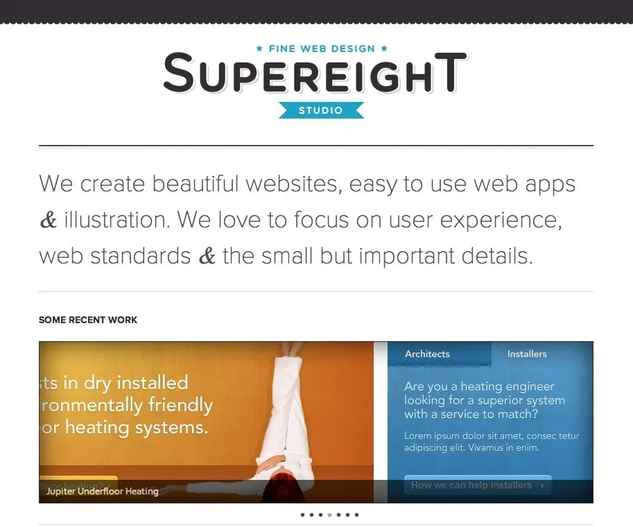
When Pete Orme and I left our jobs at Kyan.com and co-founded the design studio in 2009, we designed the first logo ourselves. It was very much of its time: a chunky wordmark with a drop shadow, a little ribbon and “Fine web design” sitting on top. The website was the same, a single page with a slider of recent work and a lot of love for ampersands.
A peer to design our mark.
By 2012 we’d outgrown it, so we asked Brent Couchman to design a new identity. Brent now runs Moniker, one of the most respected brand agencies in the US, and even back then it was obvious he was something special. We wanted a peer to design our mark rather than doing it ourselves, and we were really happy with what he created for us. It was simple, bold and clean, and it’s lasted us a long time.
How Brent got there.
Brent’s first round explored 5 very different routes. Some combined an S and an 8 into one shape, some broke the letters into quartered circles, and one was a single looping 8. The one we kept coming back to was 2 overlapping circles, one orange and one teal, with a white line running through them to draw the 8.
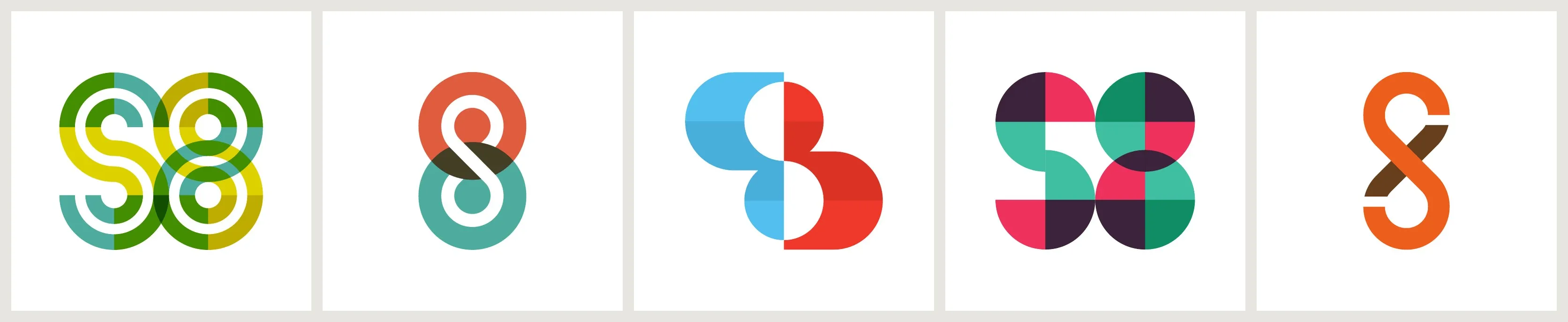
In round 2 he refined that idea, testing different colour pairings, typefaces, a round badge and a textured version for print. Round 3 tried out custom type and a few bolder colourways, but in the end we went back to the original orange and teal. It was the right call.
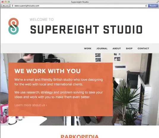
We rebuilt our website around it, borrowing the same graphic style. It was small and simple, with a big orange panel introducing us as a friendly British studio, and it did well. It was a Site of the Day on Awwwards, got picked up by plenty of other galleries, and brought in a lot of traffic and new work. The logo even ended up on our own mugs and t-shirts.
Then we got busy.
Since then we’ve barely touched either. Most of our work comes through word of mouth, so we’ve never really needed to market ourselves, and the studio’s own brand slipped down the list behind client projects. That’s a nice problem to have, but it had been far too long. The code was showing its age and the brand needed bringing up to date.
Why 8, not eight.
We picked the name back in 2009 because it sounded good and we loved Super 8 cameras. It felt like a nice visual reference for a design studio.
The word “eight” has caused us problems ever since. We’ve been called Superheight and Superwight, and spelling it out on the phone has never been fun. So this time we wanted to simplify the mark as far as it would go and use the number instead. The 8 is clearer, it’s stronger, and nobody gets it wrong.
Brent’s mark was already built from 2 circles, but the name beside it was still spelled out in full. This time we’ve taken his idea back to its simplest form: the same 2 circles, the same orange and teal, and the overlap now has a meaning of its own. Orange is design, teal is code, and the green where they meet is where we do our best work. Instead of the word “eight”, the number does the work everywhere.
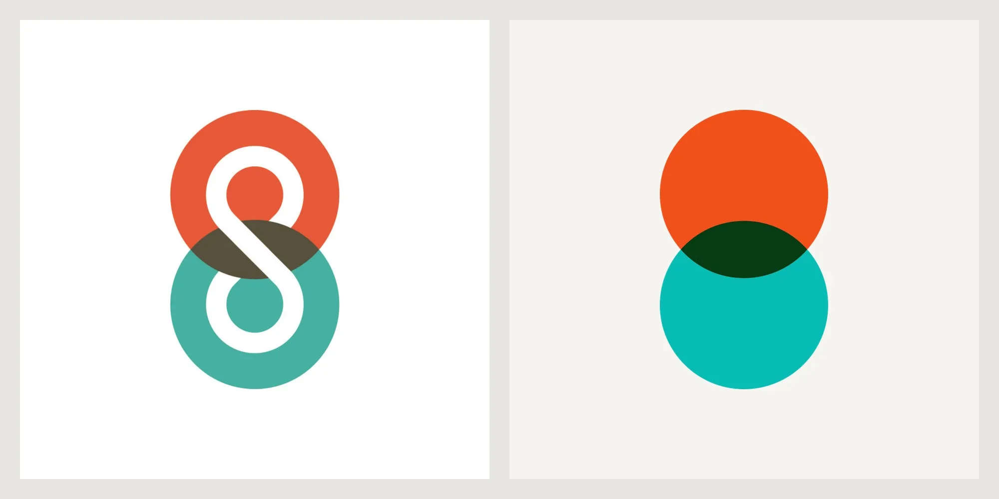
The full details, from construction to colour to type, are on our brand guidelines page.
Built differently.
We hand coded the old site in HTML, CSS, PHP and JavaScript, and the journal ran on WordPress. It served us well for years, but we wanted to try something new.
This time we built the site with Astro, with the journal and case studies running on Decap CMS, which saves everything straight to GitHub. We worked between Figma and code using the Figma MCP, host on Netlify and use Cloudflare for analytics. Claude helped us pull together ideas that had been building up for a few years and turn them into something real, very quickly. The brand and the site came together in about a week.
It’s been a lot of fun learning how to build again. Working this way takes a lot of the friction out of the process, which leaves more room for the ideas. One thing we’ve learned is that the tools are only as good as what you bring to them. Knowing how to prompt well, and having your own taste when it comes to design decisions, is what gets the details right.
Who we’re working for now.
In 2012 we described ourselves as a small, friendly British studio working with local and international clients. Today most of our clients are US fintech, legal tech and cybersecurity companies. They’re also the clients we enjoy working with most. They give us room to experiment, which is usually where the best ideas come from, and the feedback we get tells us the work makes a real difference to their businesses.
The new brand is built for them: clear, confident and easy to trust. Which, as it turns out, is exactly what we needed too.